
How Mobile-First Design Is Redefining UI/UX
Smartphones have revolutionized the way users interact with digital products, making mobile experiences the primary touchpoint for accessing applications and services. Users now expect interfaces that are fast, intuitive, and easy to navigate, even in short or on-the-go sessions. This shift has prompted UI/UX design to evolve beyond static layouts, focusing on real-world usage patterns and context-driven interactions. Designing with a mobile-first approach ensures that experiences are seamless, efficient, and user-centric. As mobile engagement continues to dominate, this mindset has become crucial for delivering meaningful digital experiences. Advance your design career from anywhere with our UI/UX Design Online Course, where you’ll learn to craft engaging user experiences and intuitive interfaces through interactive sessions, expert mentorship, and hands-on projects.
Design Shift
UI/UX design has gradually moved from desktop-focused frameworks to strategies that prioritize mobile users from the start. Previously, interfaces relied on large screens and complex navigation, but mobile devices required simplification and clarity. Designers responded by streamlining layouts, emphasizing essential features, and removing distractions. This evolution has created interfaces that are more intuitive, accessible, and user-friendly across all devices. Mobile-first thinking now informs design decisions at every stage, enhancing usability and consistency.
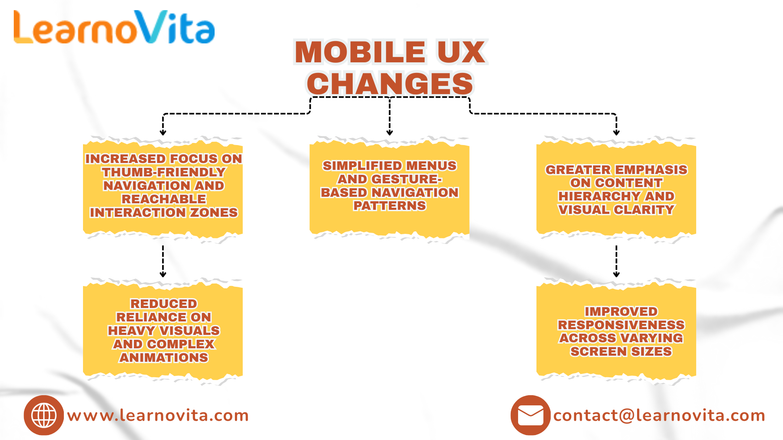
Mobile UX Changes
- Core content is prioritized for smaller screens
- Navigation is designed for easy thumb and one-hand use
- Interfaces support fast, frequent interactions
- Visual clutter is minimized to improve focus
- Layouts are responsive across various devices
- User flows are refined to reduce friction
Touch Interaction
Touch-based interaction has transformed how users engage with digital interfaces. Gestures such as tapping, swiping, and long presses have replaced traditional pointer-based actions, requiring UI elements to be larger, clearer, and more responsive. Designers focus on spacing, feedback, and subtle animations to guide users effectively. These enhancements ensure interactions feel smooth and intuitive, increasing user confidence and satisfaction while navigating mobile interfaces. Our Best Training & Placement Program is designed to equip learners with practical skills and provide strong career support to secure opportunities in leading companies.
Performance Focus
Performance is a critical aspect of mobile-first UI/UX design. Users expect instant responses and smooth transitions, even under less-than-ideal network conditions. Slow-loading screens or unresponsive elements can lead to frustration and disengagement. Designers now incorporate performance considerations into their workflows, selecting lightweight visuals and optimized interactions. Collaboration with development teams ensures seamless experiences, reinforcing reliability and user trust.
Inclusive Design
- Typography is legible across small and varied screen sizes
- Color contrast supports visibility in diverse environments
- Touch targets accommodate users with different abilities
- Simplified interactions reduce cognitive effort
- Interfaces are adapted for real-world mobile usage
- Accessibility is considered throughout the design process
Cross-Device Flow
Modern users frequently move between smartphones, tablets, and desktops. Mobile-first UI/UX design ensures consistency across all devices by using shared design systems and adaptable layouts. This continuity allows users to transition seamlessly without losing familiarity or comfort. Maintaining consistent visual language and interaction patterns strengthens usability, builds trust, and encourages long-term engagement with digital products.
Conclusion
The evolution of UI/UX design driven by mobile-first principles reflects a focus on user behavior and real-world context. Mobile technology has reshaped design priorities, emphasizing simplicity, responsiveness, and inclusivity. Designers aim to create experiences that align naturally with how users interact with their devices. As digital products continue to advance, mobile-first thinking will remain a key factor in creating effective, intuitive, and user-centered experiences.