
Shelf Strips and Wobblers That Convert Shoppers to Buyers
Retail aisles can feel hectic, with people moving fast and making snap decisions as they compare products that often seem very similar. Catching attention in that brief window is crucial. This post looks at how subtle visual cues can lift visibility and guide shoppers toward choices that feel quicker and more confident. When applied thoughtfully, these small elements help products look clearer, more organised, and more welcoming on the shelf. They create a smoother moment for shoppers who simply want to find something that feels right without slowing down or second-guessing themselves.
The Psychology of Micro-Movement Marketing
Aisle behaviour is shaped by instinctive reactions rather than deliberate thought. Most people walk through stores on autopilot, scanning shelves without fully processing what’s in front of them. This is why tiny visual triggers can make such a difference.
Shoppers notice contrast, edges, and anything with a hint of movement. A shelf strip works by creating a visual line that directs the gaze across a product range, while shelf wobblers act as little movement cues that interrupt the monotony of a long shelf. Research found that around 70% of purchase decisions happen in-store, and anything that disrupts that automatic scan can influence which product a shopper reaches for.
By tapping into this behaviour, brands can create more intuitive points of attention that feel natural rather than forced.
Disclaimer: The figures referenced reflect general industry findings and may vary based on specific retail environments.
Designing Shelf Strips That Prompt Instant Decision-Making
A shelf runs horizontally, so shoppers tend to skim it from left to right. A well-designed shelf strip supports that pattern by making the product story easier to follow.
What makes a high-impact strip:
- Strong contrast: Helps shoppers pick out information quickly.
- Simple hierarchy: A bold cue for the offer, smaller text for details.
- Clear product grouping: Colour codes, icons, or flavour swatches help break down choices.
- Directional flow: Light gradients or angled elements subtly guide the eye.
Retail studies suggest that reducing decision fatigue increases conversion. When strips help shoppers compare options faster, price, variant, size, they feel more confident and commit to buying sooner.
A small visual element that clarifies the shelf experience can create a genuinely helpful moment for people who just want a quick, confident choice.
Shelf Wobblers as Silent Salespeople
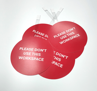
Among static shelves, motion is a magnet. Even a slight sway is enough to catch someone’s peripheral vision. That’s where shelf wobblers earn their place.
Why they work
- Movement interrupts autopilot shopping.
- Distinct shapes break up shelf uniformity.
- Short messages create curiosity or urgency.
- They suit launches, limited editions, and value cues.
Die-cut shapes like product silhouettes or flavour icons can strengthen storytelling. A round burst suggests energy, while a soft wave shape can feel calming for wellness products. These cues matter because they’re often the first thing a shopper notices.
When used right, a wobbler acts like a friendly tap on the shoulder, pointing shoppers to something worth a closer look.
Strategic Placement Framework
Placement is more than “eye level”. It’s about understanding where attention naturally pools and how shoppers interact with that space.
The Discovery Zone
The middle section of the shelf is where people naturally pause. It’s ideal for shelf strips that clarify options and for wobblers that highlight something worth noticing.
The Conversion Rail
The front edge of the shelf is prime real estate for a well-structured shelf strip. It anchors the product line, brings coherence to the display, and frames key messages such as prices or variants.
Decision Hotspots
End sections of a product block attract attention because they feel like natural stopping points. This is where shelf wobblers can act as attention hooks that draw the eye into the range.
The Echo Layer
Repeating visual cues at stretched intervals helps with recall. Shoppers often loop through aisles twice, and seeing the same design language helps brand memory stick.
This framework gives purpose to each element rather than placing signs just because the space is available.
Messaging That Drives Conversions
Words matter. When used sparingly and with intention, they act as friendly nudges that help shoppers make quicker, easier choices.
Helpful micro-copy examples
|
Purpose |
Message Style |
|
Urgency |
“Grab it today” |
|
Value |
“Great choice for families” |
|
Curiosity |
“New favourite on the shelf” |
|
Confidence |
“Loved by many” |
Short, warm, and helpful wording tends to perform better than heavy promotional language. When paired with strong shapes and colour cues, these messages feel genuine rather than salesy.
Multi-Sensory Shelf Engagement
Retail visuals can trigger sensory associations without needing touch or sound. This gives brands a chance to influence perception in subtle, clever ways.
Ideas that elevate the experience
- Textures or patterns on the strip that evoke freshness, richness, or calmness.
- Layered shapes on wobblers that create a sense of motion or depth.
- Colour stories that match the mood of the product category—cool tones for hydration, rich tones for indulgence.
- Micro-shadows behind printed elements to create a gentle 3D effect.
These details help products feel more alive on the shelf, even though the shopper never physically interacts with the display. When combined with smart placement, they create a richer sense of presence that supports the buying moment.
Cohesive Shelf Strip + Shelf Wobbler System
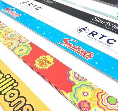
The real magic happens when these tools work as a coordinated set. A shelf strip lays the foundation: It organises information, guides the eye, and gives the range a defined structure. Shelf Wobblers then add personality, motion, and excitement. Together, they balance clarity with energy.
Here’s a simple alignment rule:
- Strip = structure
- Wobbler = spark
When colour, tone, and message style remain consistent across both, the shelf feels thoughtfully curated. Shoppers read the range faster, understand the story, and feel more confident in their choice, especially when comparing similar products in crowded categories.
Conclusion
Small shelf touches can shape how people move, pause, and choose during their shopping trip. With the right visual cues and a thoughtful approach, brands can make the shelf feel clearer and more inviting. When coordinated well, these tools support strong buying moments without overwhelming shoppers. If you’re planning your next in-store project, Board Printing Company can help you bring these ideas to life with meaningful, well-crafted displays that feel natural and customer-friendly.